Work
Accelerate
Industry: FinTech / B2B
Deliverables: Content & Website Design
Year: 2023
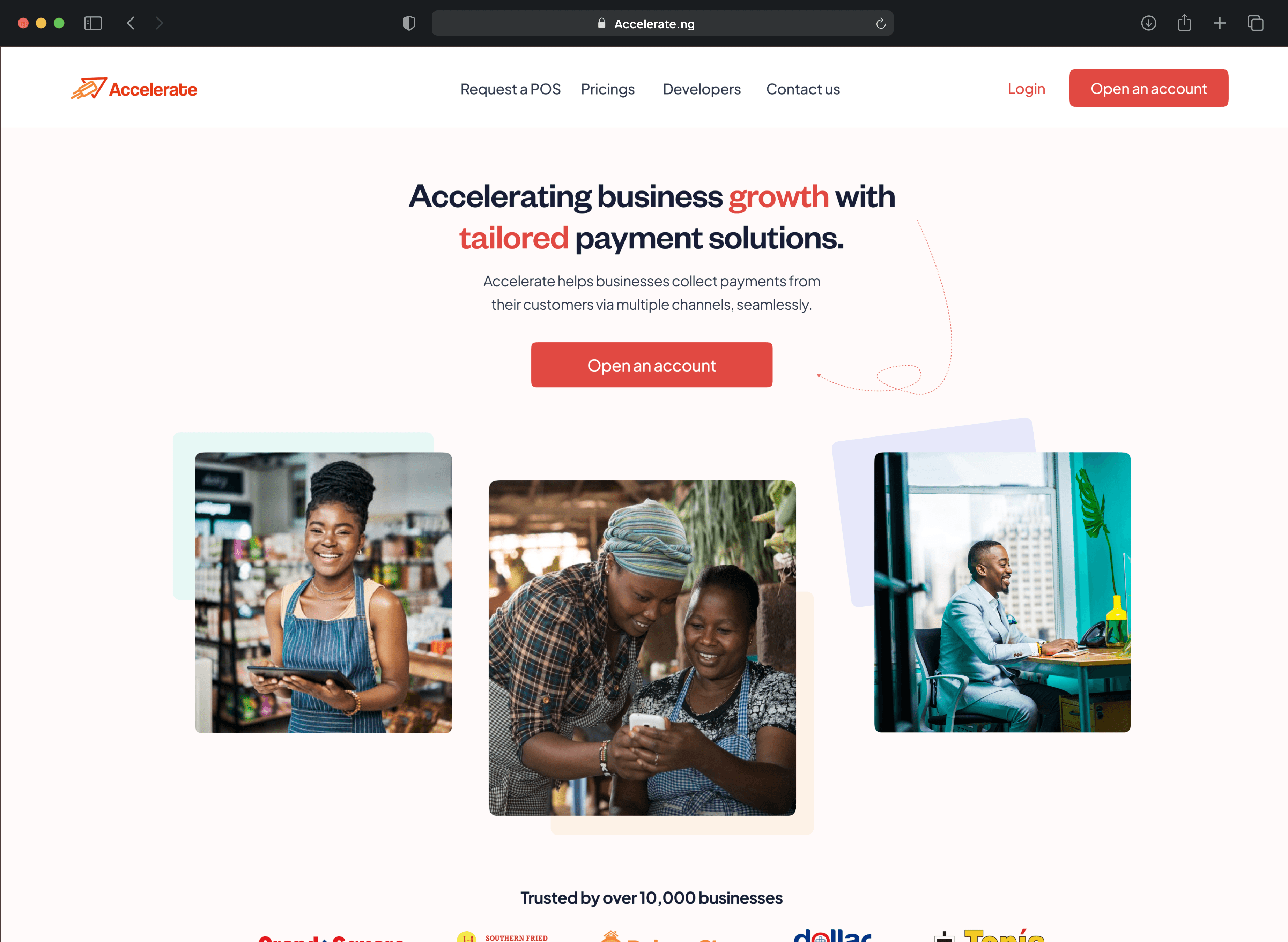
Snapshot of Accelerate new website
Accelerate is a Fintech platform that provides tailored payment tools for businesses to collect payments from customers across Nigeria. After conducting a year-end review, stakeholders expressed frustration with the current Accelerate website's inability to convey their value proposition, resulting in little to no conversions from website visitors.
For this project, I worked as the sole designer, redesigning the entire experience from prototypes to developer handoff. Additionally, I was responsible for enhancing all copies and content on the website.
The project was primarily managed by Accelerate's Head of Growth and Implementation, along with a Growth Specialist.

To better understand how to redesign Accelerate, I started by gaining a deep understanding of its offerings and intended audience. This helped me grasp the personality, tone, and feeling I needed to convey in my designs and copies.
Accelerate is a B2B platform meaning that they targets SMEs, corporations, government bodies, and startups that provide services or sell products that require them to receive payments online/offline.

Images conveying Accelerate Audience
After gaining a clear understanding of Accelerate's offerings and intended audience, I conducted a thorough UX audit of the existing website using these (6) cardinals: Content structure, Responsiveness, Navigation, Visual design, User feedbacks and Accessibility.
These are my findings:
Vague and generic content
The content on the website was vague and did not effectively communicate the benefits of Accelerate and its offerings.
Severity: Must Fix
CTAs are not prominently displayed.
Throughout the website flow, there was only one CTA present in the navigation section. This means that users have to scroll back to that section whenever they want to perform an action.
Severity: Must Fix
Lack of trust signals/social proofs
No visible client testimonials, User reviews, or trusted partners that would have helped with website credibility and user confidence on the brand.
Severity: Must Fix
Mobile responsiveness issue
The existing website didn’t have a mobile-friendly design and has a bad layout on mobile devices. Additionally, the image positioning was not optimal.
Severity: Needs improvement
Unrelated visuals and graphics
The existing website had vague images and graphics that did not effectively communicate Accelerate's offerings and benefits.
Severity: Must Fix
Color accessibility issues
The website's use of dull colours was noticeable. Additionally, the lack of colour contrast on some text copies made them illegible, especially for individuals with visual impairments.
Severity: Needs improvement
Based on the insights from the UX audit, I realised that content structuring would play a significant role in my redesign. To address this, I collaborated with one of Accelerate's growth specialist and drafted a content strategy with the goal of promoting Accelerate's offerings in an engaging tone.


Snapshot of Accelerate Content Strategy on Notion
I conducted a competitive analysis of websites offering products similar to Accelerate, including Brass, Moniepoint, OurPass, Mono, Paystack, Alerzo, and Thepeer. The objective of the analysis was to understand how these websites sell their offerings and establish trust in order to drive engagement and conversion.
The goal for the new website homepage was to ensure that visitors could instantly understand the offerings and benefits of Accelerate. I achieved this through my choice of copy and imagery.

Intuitive navigation labelling
1
I rearranged the navigation bar to include only the pages that users needed to find specific information. I also ensured that the labels were clear and intuitive.
Catchy tagline
2
I started off the header section with a catchy tagline that instantly showcase how Accelerate would benefits businesses.
Relatable images
3
To make the new website more engaging and appealing, I included images that related to Accelerate offerings and targeted audience.

Visible trust signals
4
I included the number of businesses currently using Accelerate to boost user confidence on the platform. Additionally, I included the logos of prominent businesses that use Accelerate.
Catchy headings
5
Ensured that every aspect of the homepages was introduced with a catchy headline that clear explain the intended purpose of that section.
Relatable graphics
6
In addition to including relatable imagery, I also made sure to add graphics and illustrations that reinforced the message I was conveying in a particular section.
Prominent CTAs
7
The "Get Started" button was the third button on the homepage. I ensured that every section of the homepage has a call-to-action (CTA) in case a website visitor decides to take action at any time.

Developer side of things
8
I included a section specifically for developers. This section highlighted Accelerate ‘s API, its benefits and a call to action in case a website visitor was interested.
Snapshot of developer’s API
9
I also included a snapshot of the API to give developers a glimpse of what it looks like.
Spotlighting core benefits
10
I picked out the core benefits of using Accelerate that would instantly convince a business and decided to emphasise those benefits.

Visible social proof
11
I added a testimonials section that captured reviews from our existing customers. This was aimed at conveying trust and confidence to website visitors.
Well Contrasted Footer
12
On the previous website, the color contrast on the footer was pleasant to see, especially for users with visual impairments. I corrected this by using the suitable color contrasts that suits all users.
Businesses should have a strong belief we are transparent with our commissions and chargebacks. That was the experience I wanted to convey on the pricing page.

Tailored pricing
1
I added a "tailored pricing" section to let visitors know that we guarantee a customized solution for them, including a pricing plan that meets their specific needs.
Pricing calculator
2
The pricing calculator enables businesses to calculate the interest we will charge for any transaction they make.
The "request a POS" page is a crucial page on the Accelerate website. It allows businesses to easily request a POS Terminal.

How to request steps
1
This section gives a detailed steps on how to easily request a POS terminal from Accelerate.
Prominent CTAs
2
On the request-a-POS page, Accelerate encourages users to request a POS terminal in addition to opening an account. To achieve this, I ensured that the CTA was prominently visible on the page.
I also designed the mobile view of the entire website to ensure consistency and responsiveness throughout.


I had so much fun redesigning Accelerate, especially because I got the opportunity to flex my content design and strategy muscles. I presented my redesign to stakeholders, detailing every design decision, and they loved it and was approved for production.
More work
(6)


